
apexflow
The Human Performance Layer for Racing: Introducing Yudemon ApexFlow
Max Frenzel, PhD · 12 January 2026 · Updated 4 September 2026 · 12 min read
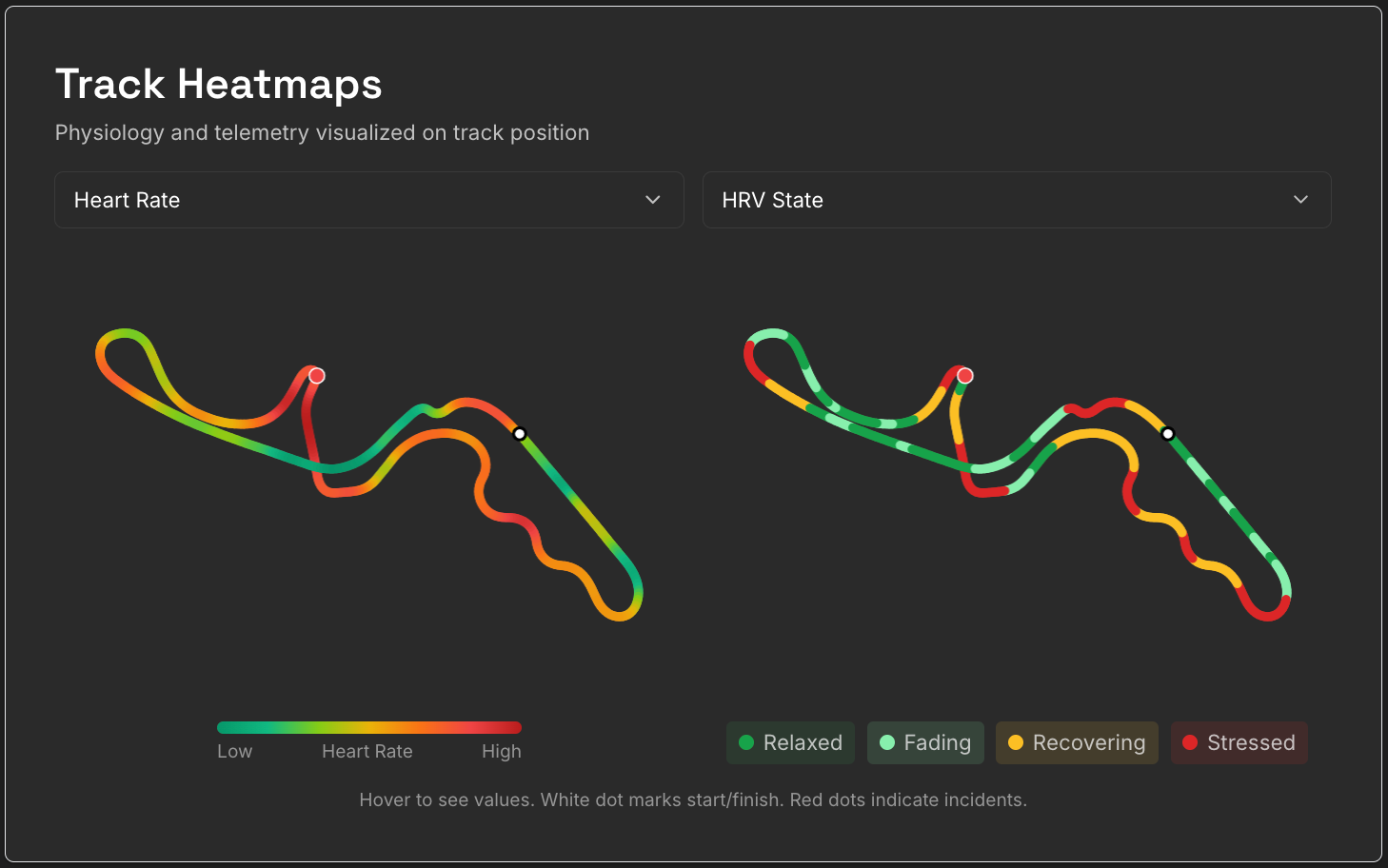
Heart rate and HRV state mapped to track position in ApexFlow
[TL;DR: You can try ApexFlow here.]
Update, September 2026: ApexFlow has moved on since this post. You can now record with the Yudemon HRV app on your phone instead of the desktop app – both routes are in the Getting Started guide. And the Stress Zones & Recovery analysis described below was retired after a full season of data showed its recovery grades weren’t reliable; its place is taken by Your Race, Braking Response and the Physiology Under Pressure insights, all covered on the ApexFlow page. The rest of this post is left as written at launch.
Motorsport lives on data. Speed traces, throttle inputs, braking points, G-forces, tire temperatures, and much, much more. Modern racing – whether in the sim or in real life – gives us huge amounts of continuous data streams. We can see exactly what the car did and in what state it was at every point on the track.
But there’s always been a missing piece: what’s happening inside the driver?
I’ve been sim racing for years, and also got my first real-world track experiences last year. I’ve spent countless hours studying telemetry, watching onboards, and trying to optimize my driving line.
But my driving state, that’s a different matter. Why did some sessions feel so effortless and calm – while also being fast and free of incidents – and others were barely contained chaos or saw me making one mistake after another?
Questions like these, combined with my multi-year experience of building Yudemon into a successful HRV biofeedback app, led me to create ApexFlow – an entirely new offering within the Yudemon family.

What is ApexFlow?
ApexFlow combines physiological data from a chest strap sensor with racing telemetry, letting you explore how your internal state relates to what happens on track.
It’s not a coaching tool that promises to make you a faster or better driver (at least not yet). It’s an exploration tool – a way to see patterns you might not notice otherwise. Where does your heart rate spike? How quickly do you recover after an intense sequence of corners? Is there a difference in your physiology between practice and race sessions?
These are questions I’ve always been curious about, and now there’s a way to explore them.
ApexFlow is currently available for iRacing, with plans to expand to real-world telemetry very soon.
What You’ll Discover
Before diving into the details, here’s a taste of what ApexFlow can show you:
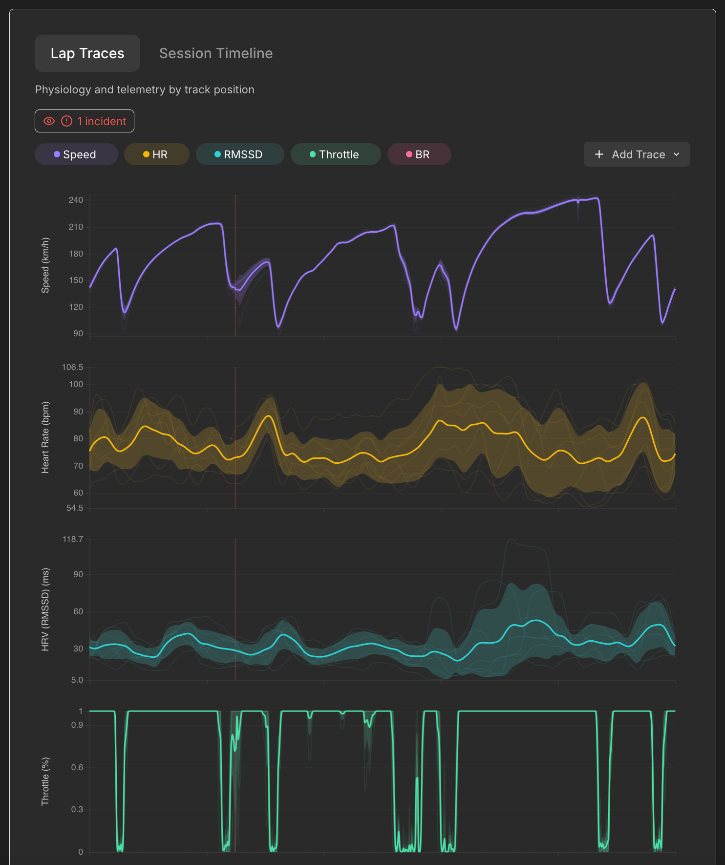
Lap traces showing speed, heart rate, HRV, and throttle synchronized by track position
Physiology meets telemetry. See your heart rate, HRV and other physio metrics overlaid with speed, throttle, brake, and G-forces – all synchronized to track position. Each thin line is an individual lap; the bold line is the average. It’s a familiar view for anyone who’s looked at racing telemetry, but now with a physiological dimension.
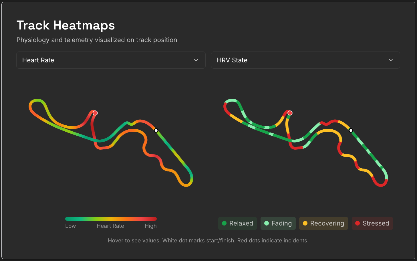
Track heatmaps showing heart rate (left) and HRV state (right) mapped to the circuit
Track heatmaps. Compare any two metrics side by side – heart rate vs. HRV state, speed vs. G-force, whatever you’re curious about. You can immediately see which corners consistently elevate your heart rate.
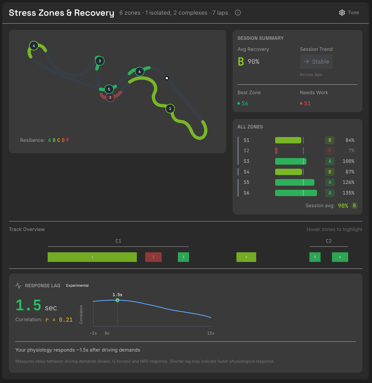
Stress Zones & Recovery analysis with per-zone recovery scores
ApexFlow automatically identifies high-demand sections of the track (based on G-forces) and measures how your HRV responds and recovers through each one. This is still experimental – I’m refining how it works – but it’s a first step toward making the data more actionable.
Update, September 2026: Stress Zones & Recovery has since been retired – see the note at the top of this post.
Getting Started
If you want to try ApexFlow, the Getting Started page has everything you need: download links, setup instructions, and a walkthrough of what to expect.
The short version: you’ll need a Windows PC, a Bluetooth heart rate sensor (I recommend the Polar H10), and iRacing. The data collection happens through a small desktop app, and everything else lives in the web dashboard.
Update, September 2026: a Windows PC is no longer required – you can record with the Yudemon HRV app on your phone and upload the telemetry files on the web afterwards. The desktop app remains the most convenient route once installed. Both are covered step by step in the Getting Started guide.
The Desktop App: Collecting Your Data
The ApexFlow desktop app handles the data collection during your racing sessions. It’s designed to stay out of your way – set it up once, and it runs quietly in the background while you drive.
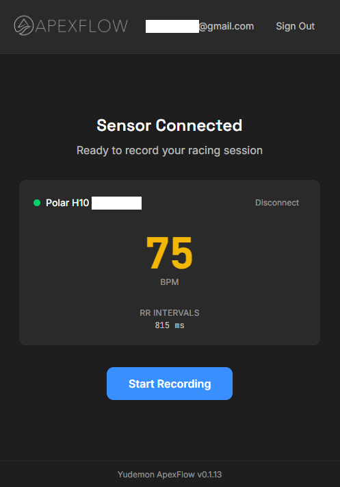
The desktop app after connecting to a bluetooth heart rate sensor.
Connect your sensor. The app scans for Bluetooth devices and lets you select your heart rate sensor. A quick note: right now it shows all Bluetooth devices, not just HR sensors, so you’ll need to pick the right one from the list. Once connected, you’ll see your live heart rate and RR intervals (the time between consecutive heartbeats) in real-time.
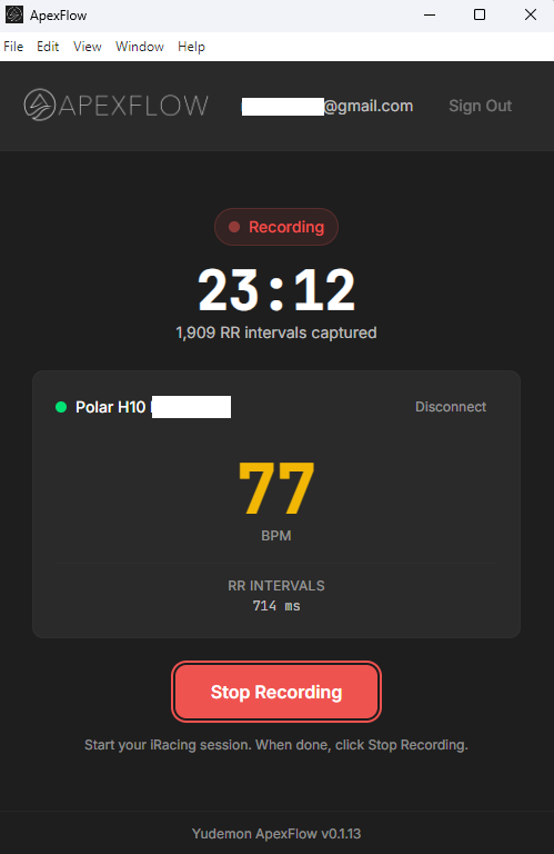
Recording in progress – the app tracks duration and captured RR intervals, while also monitoring your iRacing telemetry files.
Record your session. Click “Start Recording” before you head into your iRacing session. The app captures your RR intervals (the time between heartbeats) throughout your driving. When you’re done, click “Stop Recording.”
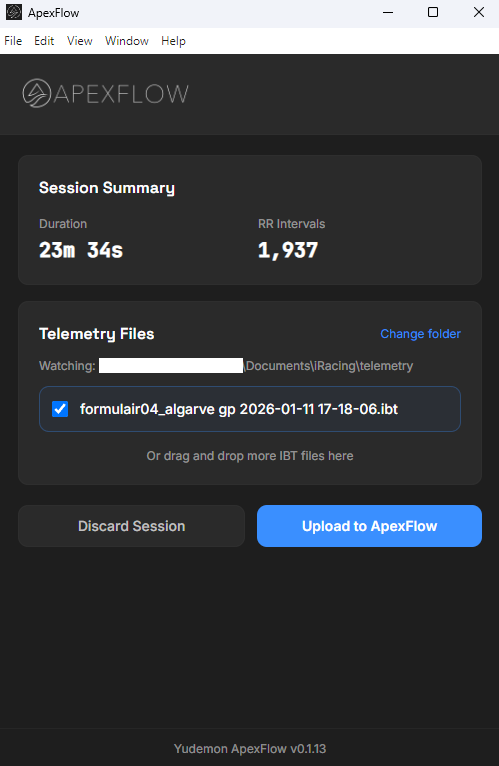
Session summary with auto-detected telemetry files ready for upload
Upload with one click. The app automatically watches for iRacing telemetry files (.ibt) created during your recording window. Select the files you want to include and click “Upload to ApexFlow.” The processing usually takes anywhere from a few seconds to a couple of minutes depending on session length.
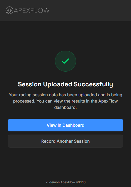
Upload complete – ready to view in the dashboard
Once processing is complete, your session appears in the web dashboard, ready to explore.
A note on installation: The app isn’t code-signed yet, so Windows will show security warnings when you first install it. This is normal for independent software. The Getting Started page has detailed instructions for working through these warnings.
The Dashboard: Exploring Your Sessions
The web dashboard at app.yudemon.com/apexflow is where your data comes to life.
Sessions: Your Racing History
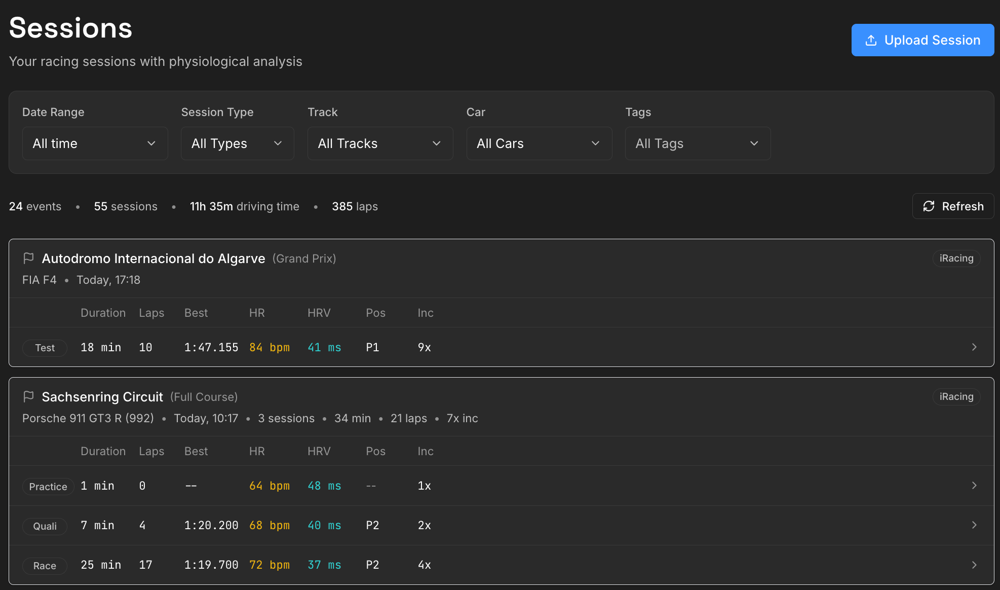
The Sessions page with filtering options and event grouping
The Sessions page shows all your uploaded sessions, grouped by event. If you did for example practice, qualifying, and a race at the same track within a single recording session and uploaded the IBT files together, they’re grouped together.
You can filter by date range, session type, track, car, and custom tags.
Each session row gives you the key stats at a glance: duration, laps, best lap time, average HR and HRV, finishing position (for races), and incident count.
Session Detail: The Deep Dive
Click any session and you’re taken to the detailed analysis page.

Session header showing key stats, position changes, and data quality indicator
The header shows everything important about the session: track, car, date, duration, laps, best lap time, average HR and HRV, HR range, and – for races – your starting and finishing positions with places gained or lost. You can also add custom tags for later filtering, export the raw data as CSV, or delete the session.
For events with multiple sessions, tabs let you quickly switch between practice, qualifying, and race without going back to the list.
Lap Traces (see screenshot above) show your physiology and telemetry averaged across all laps of a session, synchronized by track position. You can add, remove, and reorder traces – currently there are 10 telemetry metrics and 6 physiology metrics available. Each individual lap appears as a thin semi-transparent line; the average is the bold line. This immediately reveals where you’re consistent and where there’s variation.
You can toggle incident markers on or off. When enabled, vertical lines mark where incidents occurred, color-coded by severity (yellow = 1x, orange = 2x, red = 4x).
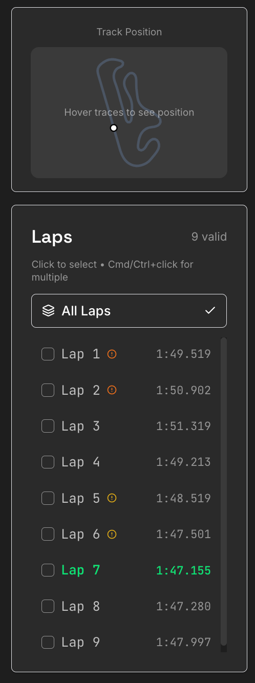
Lap selector showing lap times with incident indicators
The Lap Selector lets you focus on specific laps. Maybe you want to compare your fastest laps, or isolate the laps after an incident, or just look at the first half of a stint. Select any combination and all the visualizations update to show only those laps. The lap times are displayed with incident indicators so you can quickly identify clean laps vs. messy ones.
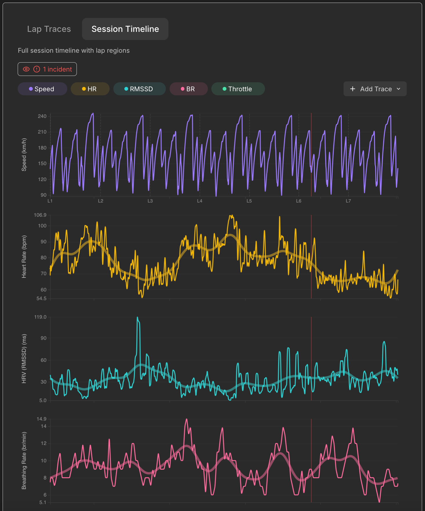
Session Timeline showing the full session duration
Session Timeline shows the same traces, but unrolled over the entire session duration rather than by track position. This view is interesting for seeing how your session evolved – maybe your heart rate was elevated at the race start and settled mid-race, or maybe fatigue crept in during the final stint. You can see exactly when incidents happened and how your physiology responded.
Track Heatmaps visualize any metric mapped onto the circuit itself. Two side-by-side maps let you compare any two metrics – heart rate vs. HRV state, speed vs. G-force, whatever you’re curious about. The track shape comes from GPS data in the telemetry, so it’s an accurate representation of the circuit. Incident locations are marked with yellow, orange and red dots.
Stress Zones & Recovery is more experimental. ApexFlow automatically identifies continuous high-G sections of the track – corners, chicanes, heavy braking zones – and analyzes how your HRV responds through each one. For each zone, it measures your baseline HRV before the zone, the drop during the zone, and the recovery afterward, producing a “recovery score” from F to A.
I’ll be honest: I’m still refining how this works and what the scores actually mean. Take it with a big grain of salt for now. It’s definitely interesting, but I don’t know how informative, useful or actionable it actually is. But it’s a first attempt at turning the raw exploration data into something more structured. I’d actually love to hear from users what they find useful here and what doesn’t make sense – that feedback will help shape how this feature evolves.
Update, September 2026: the grain of salt was warranted. A full season of data showed the recovery grades were not reliable, and the feature was retired – its slot on the session page is now taken by Your Race and Braking Response.
Insights: Patterns Across Sessions
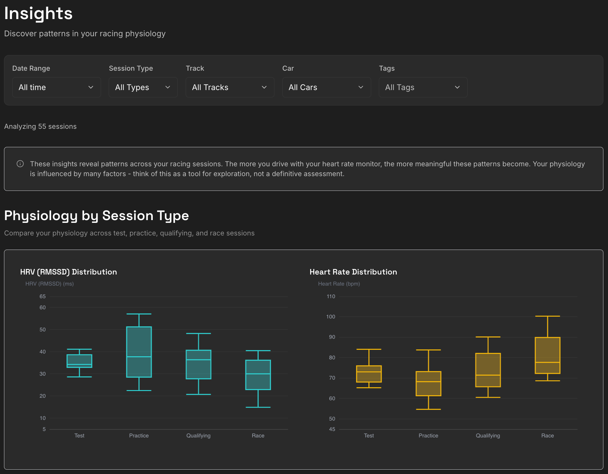
The Insights page with filtering and Physiology by Session Type
The Insights page aggregates data across all your sessions to reveal patterns. It has the same filtering options as the Sessions list, so you can narrow down to specific tracks, cars, or time periods.
Physiology by Session Type shows box plots comparing your HRV and heart rate across test, practice, qualifying, and race sessions. Are you more stressed in races? Does your HRV drop during qualifying? The data will tell you.
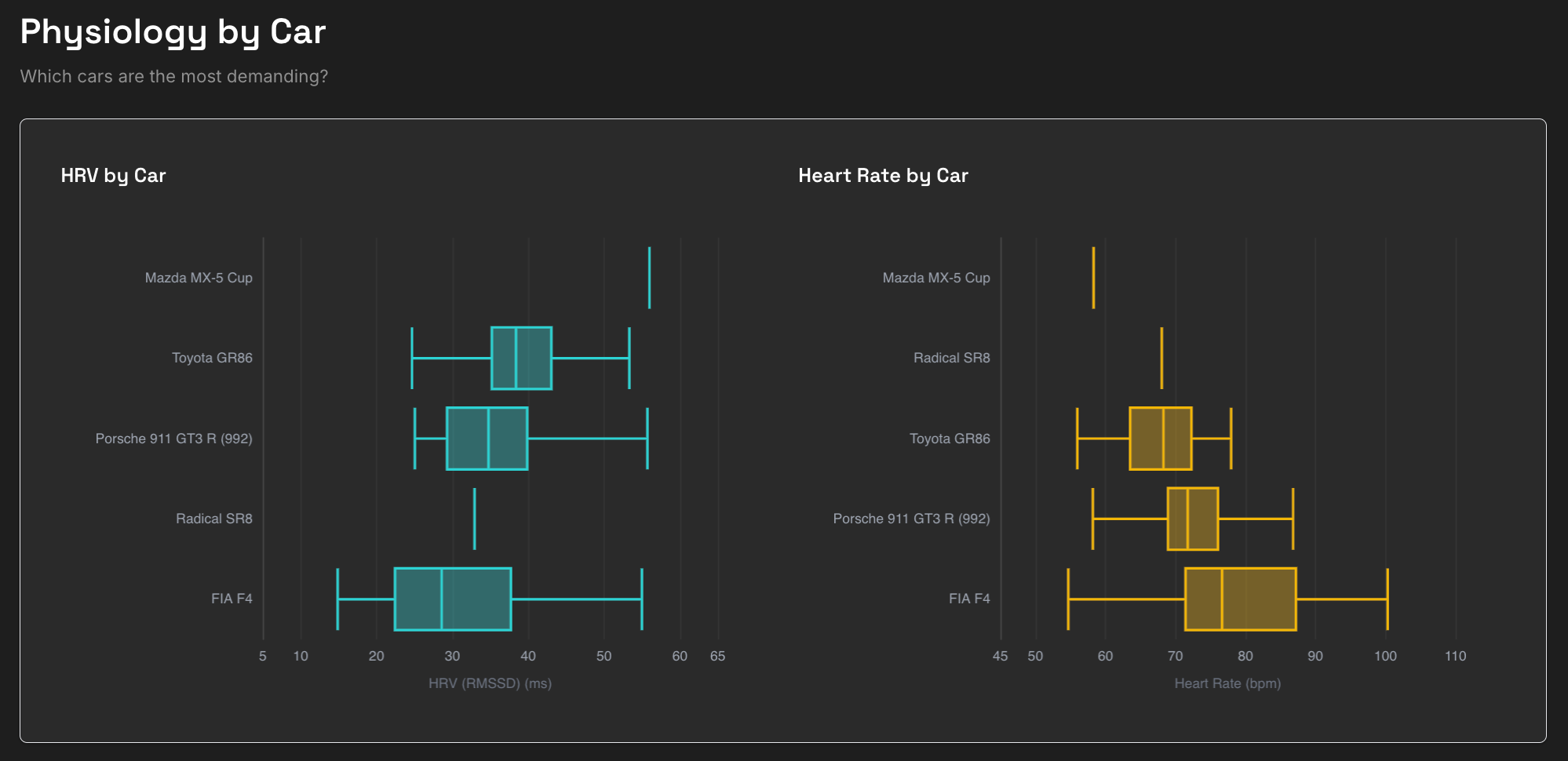
Physiology by Car comparison
Physiology by Car does the same breakdown by vehicle. Maybe you’re more relaxed in slower cars, or maybe the opposite is true. I haven’t collected too much data yet, so this is not particularly statistically significant, but F4 looks far more intense than a Toyota GR86 so far, and that definitely aligns with my subjective perception.
There are also breakdowns by track, time of day, incident rates over time, and more. This section is still early – I’ll be adding more insights and refining existing ones based on what’s actually useful. Again, I’d love to hear what patterns you find interesting and what you wish you could see.
A quick word of caution: these insights become more meaningful as you accumulate more sessions. With just a handful of data points, don’t read too much into the patterns. Physiology is influenced by countless factors – sleep, stress, caffeine, what you ate, how your day went,... The real patterns (assuming there are any) will emerge over weeks and months of consistent data.
A Note on ApexFlow Pro
ApexFlow is free to use, and that includes full access to all session analytics for your most recent event.
For older events, some of the advanced analysis features and cross-session insights require an ApexFlow Pro subscription. ApexFlow Pro also includes all Yudemon Pro features if you want to train your autonomic nervous system using Yudemon’s HRV biofeedback app.
I wanted to mention this upfront so there are no surprises. The free tier is genuinely useful for exploring your latest sessions – Pro just unlocks the historical depth (and helps me pay for the infrastructure cost, and hopefully justify future development).
What’s Next?
ApexFlow is live and functional, but it’s really just the beginning. Here are some directions I’m currently thinking about:
Real-world telemetry support. iRacing is the starting point, but I want to bring this to real-world racing as well. Supporting formats like AiM and MoTeC would open ApexFlow to track day enthusiasts, amateur racers, and motorsports professionals. If you’re interested in using ApexFlow with real-world data, I’d love to hear from you – it’ll help me prioritize.
Baseline comparisons. Right now we’re only looking at in-session HRV. But comparing to a pre-session baseline – your HRV while sitting on the grid waiting for the start, for example – could add meaningful context.
Audio cues and breathing guidance. This is where ApexFlow could connect to its “older sibling”, the main Yudemon HRV biofeedback app. Imagine guided breathing exercises while waiting on the grid, or audio cues on long straights when you’re not in an immediate battle to help you reset your focus.
These are ideas, not promises. What I actually build next will depend a lot on what users find valuable. So please – if you try ApexFlow and have thoughts about what works, what doesn’t, or what you wish existed, let me know. You can reach me through the Yudemon contact page or find me on social media.
Try It Out
ApexFlow is available now at app.yudemon.com/apexflow.
If you have iRacing, a Bluetooth heart rate sensor, and either a phone with the Yudemon HRV app or a Windows PC, you can be looking at your first recorded session data in less than 30 minutes. The Getting Started page walks you through everything.
I built this because I was curious about my own racing physiology, and I hope it helps satisfy that same curiosity for you. Not as a magic tool that makes you faster, but as a new lens on what’s happening inside you when you’re pushing hard on track.
Right now, this is exploratory. But depending on what insights we find, we might be able to turn this into actionable advice that help us become better, more resilient, and more consistent drivers.
See you on the track!